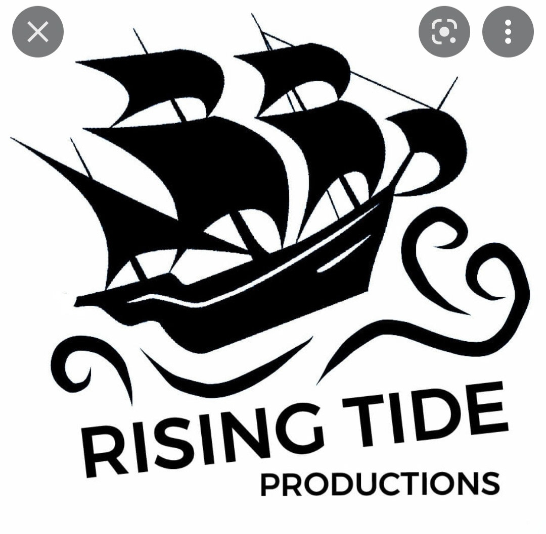
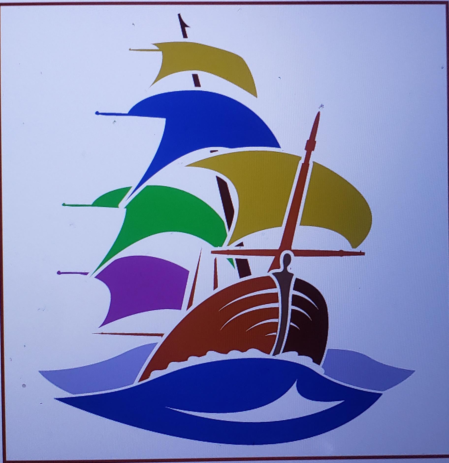
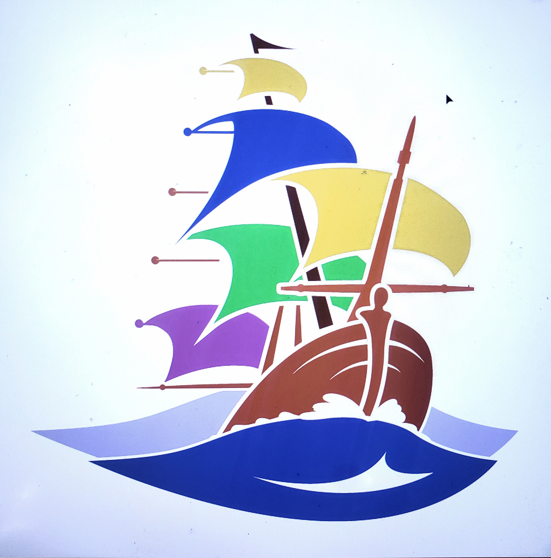
In February of 2022 a good friend, Casey Jane, asked for help rebranding her Theater Company, Rising Tide out of Kansas City, MO. I knew they wanted a new logo and new general style to help with inspiration for a website. I knew that I was marketing an exciting product: nuanced and sophisticated storytelling that stays current. I researched their past logos, and other companies that use their intended imagery which was a sail boat.
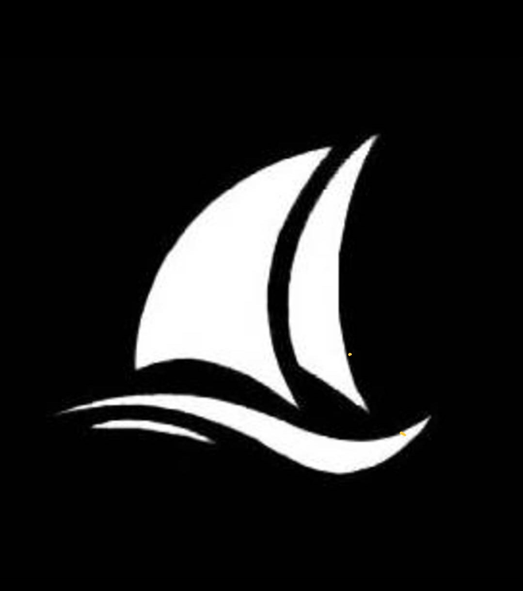
All of these examples of boat logos lacked the majesty that I thought a Theater Company deserved. Researching imagery of sail boats cresting a wave, I discovered an abundance of inspiration from The Crest of a Wave by Montague Dawson, pictured below.
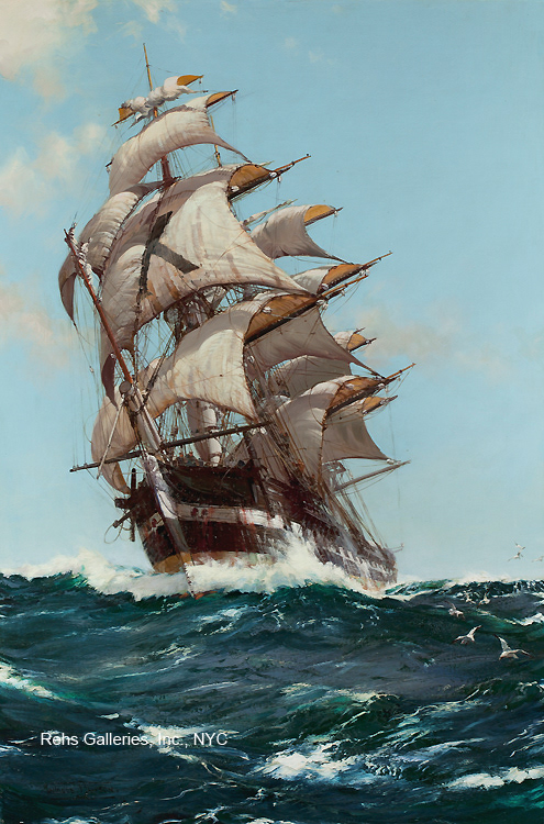
So I set off to create a vector and logo form of this painting. I knew the hardest job would be to keep its grandeur while simplifying as much as possible.
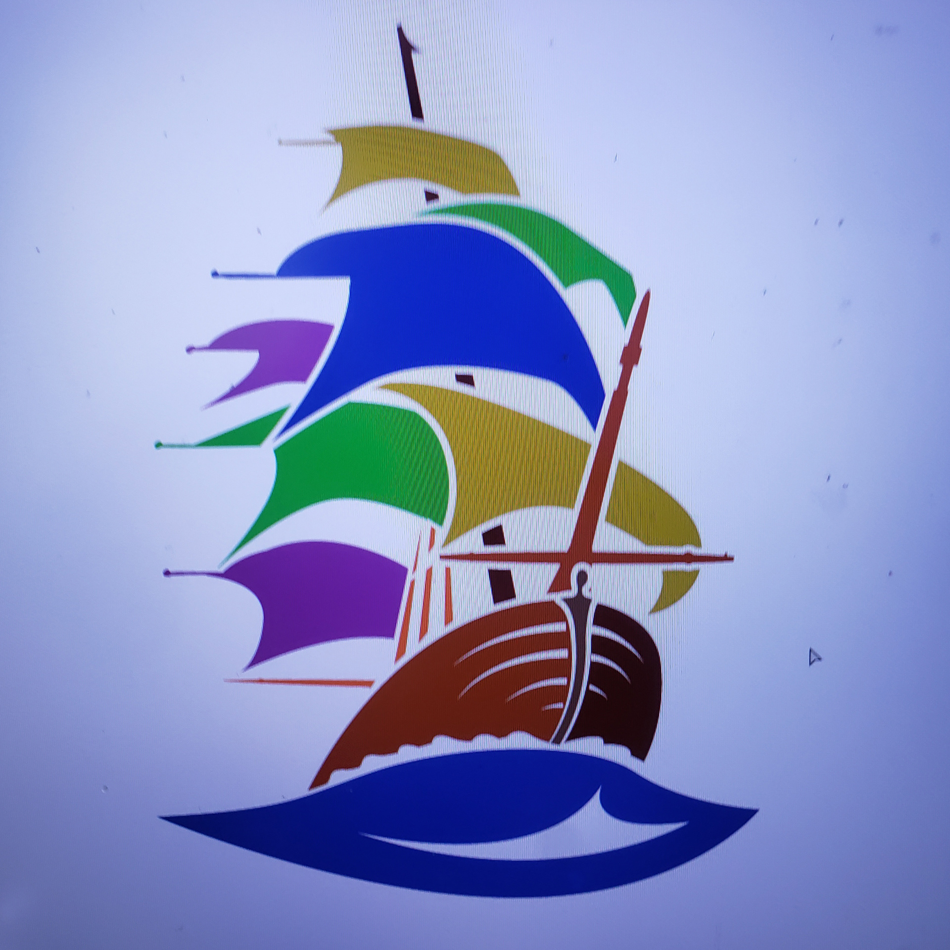
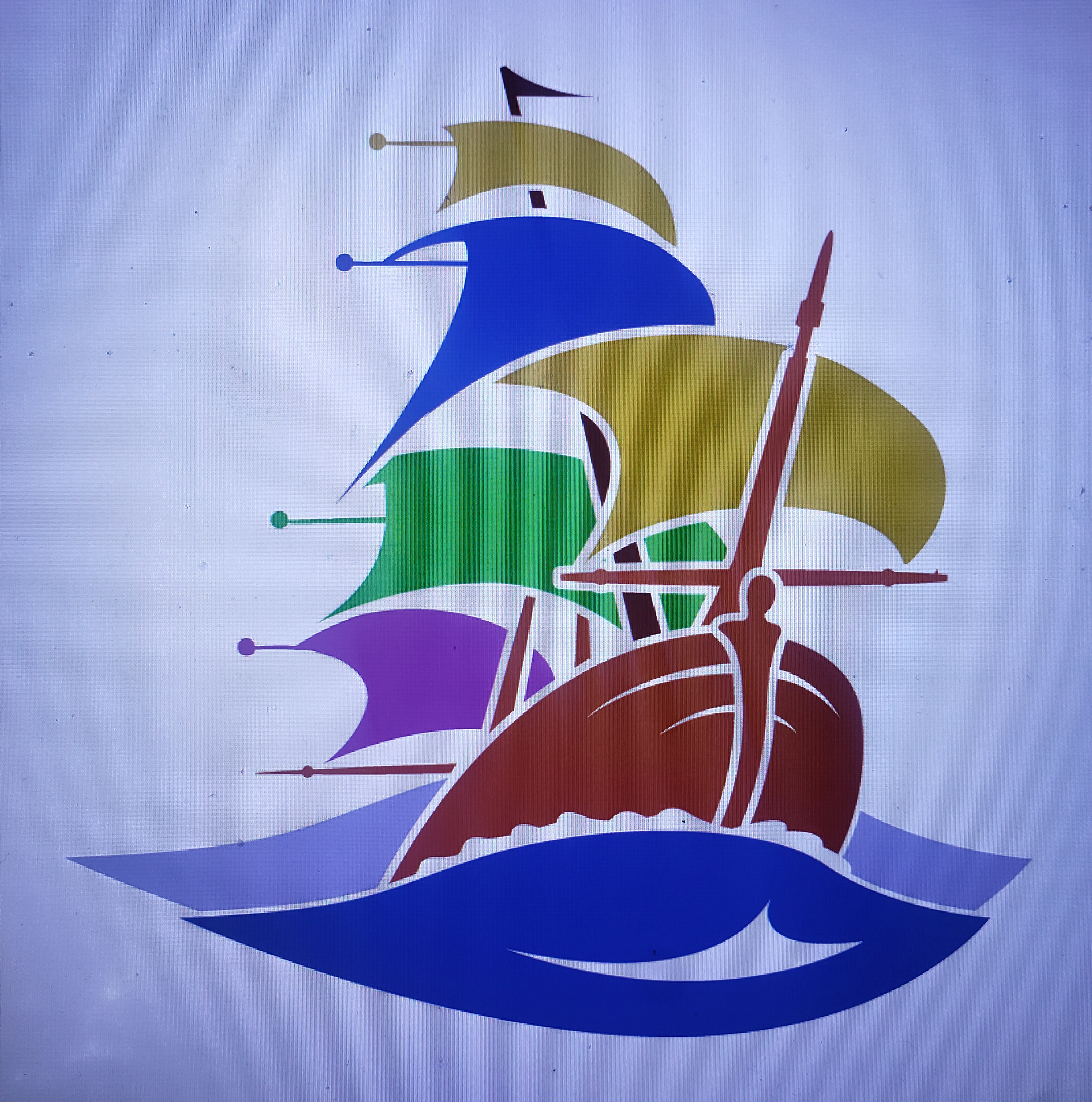
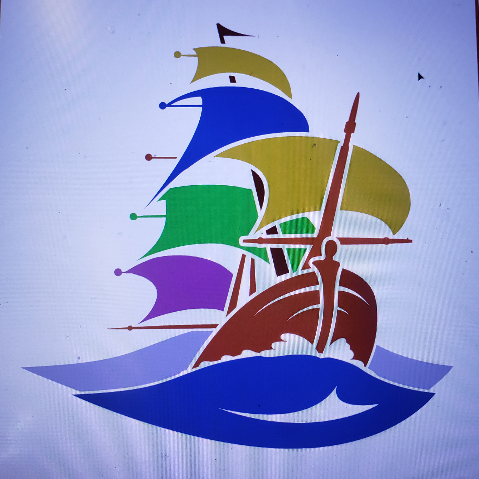
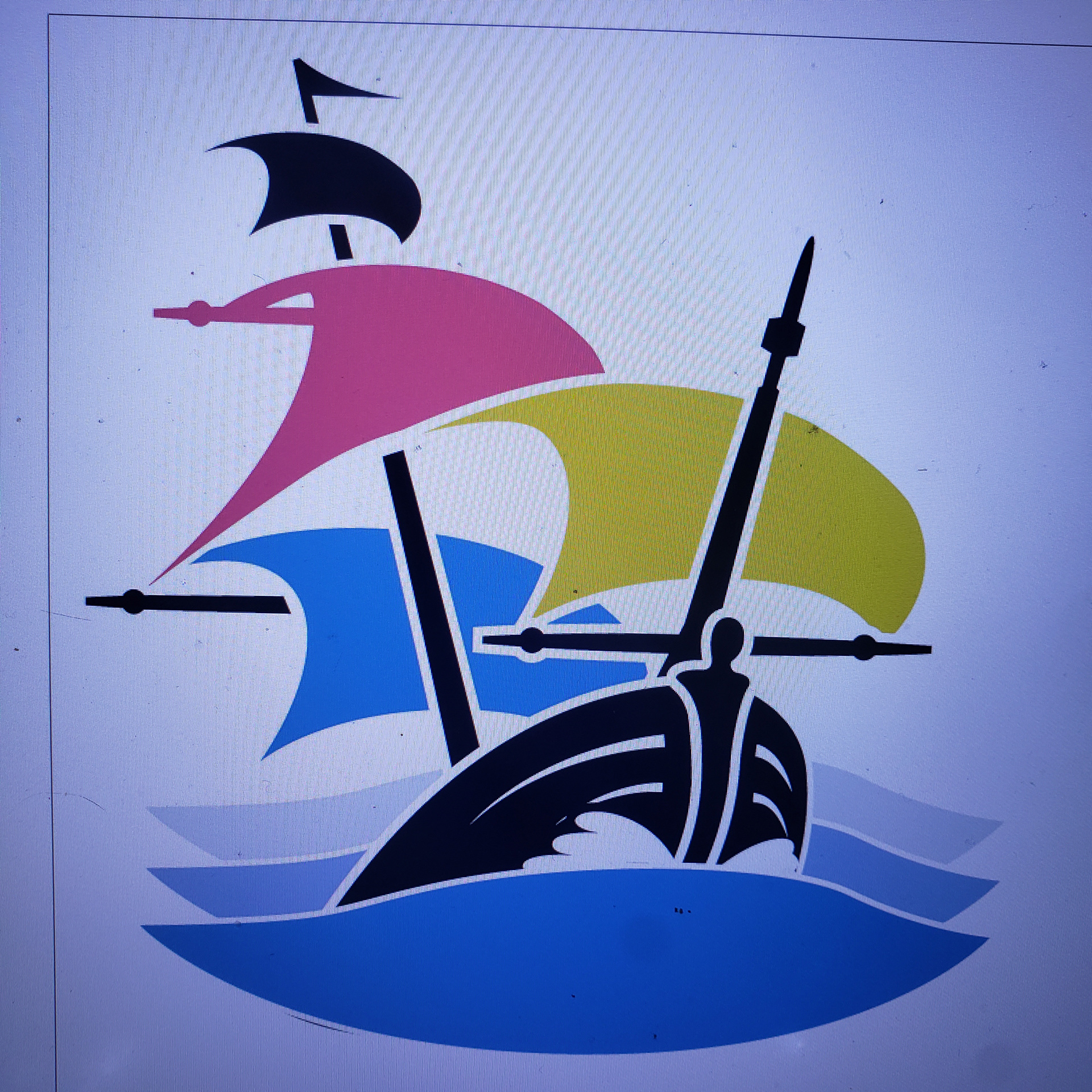
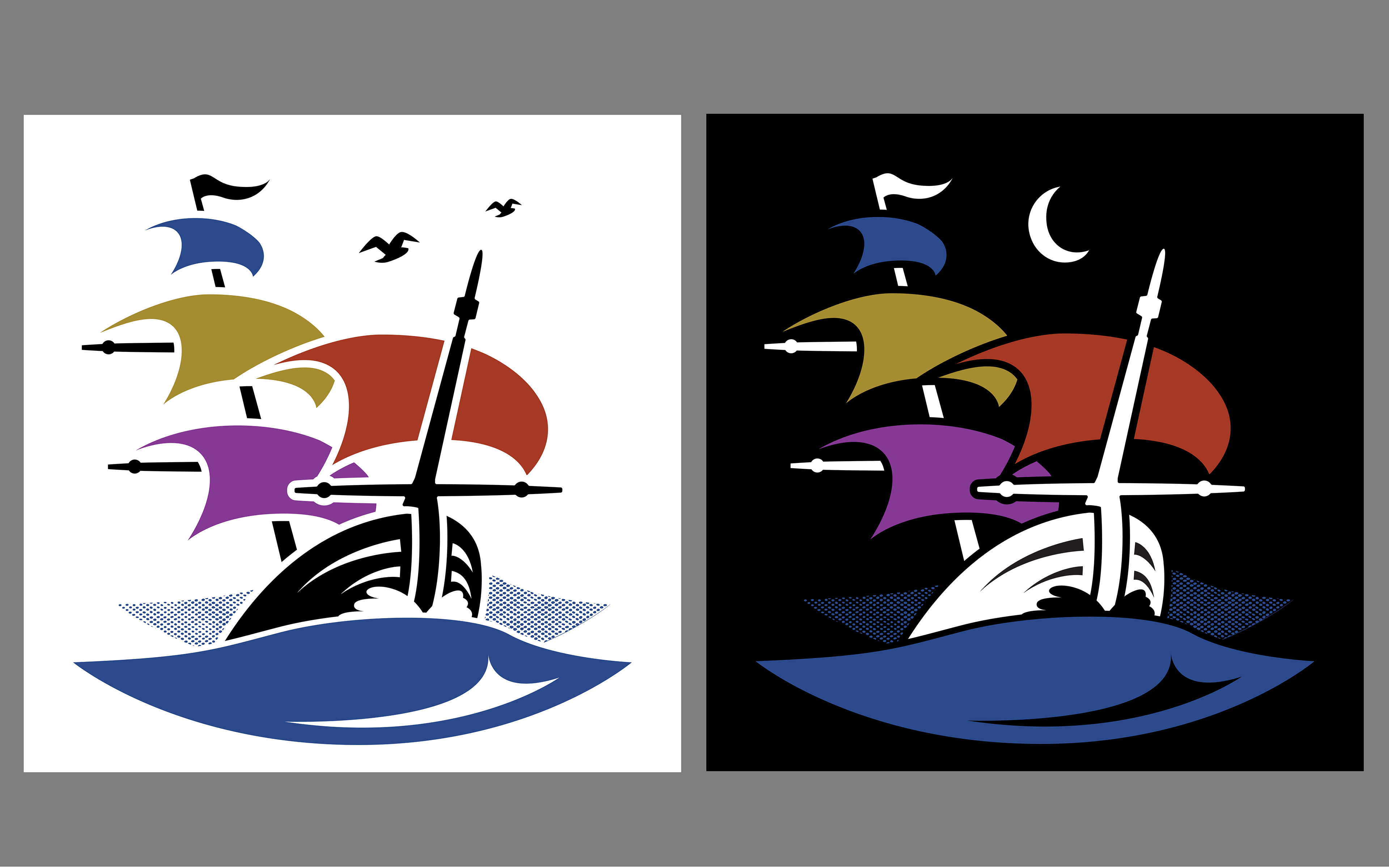
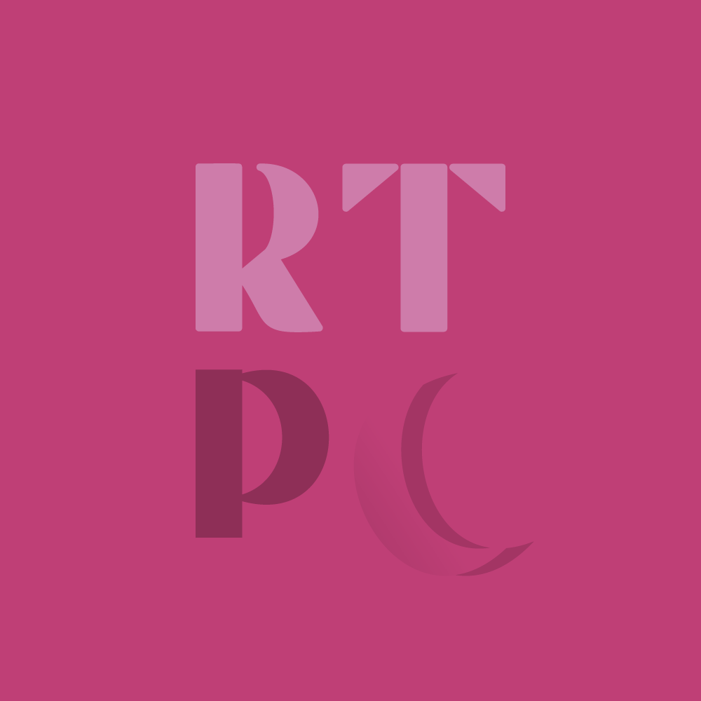
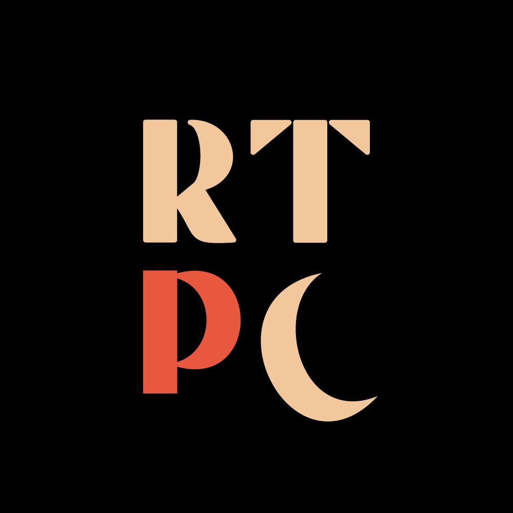
We played with a lot of different options for the logo styling and spent a fair amount of energy finding the right colors, but certain aspects of typography fell into place. For instance, the font used here offered the inspiration to include the moon in the logo's imagery.
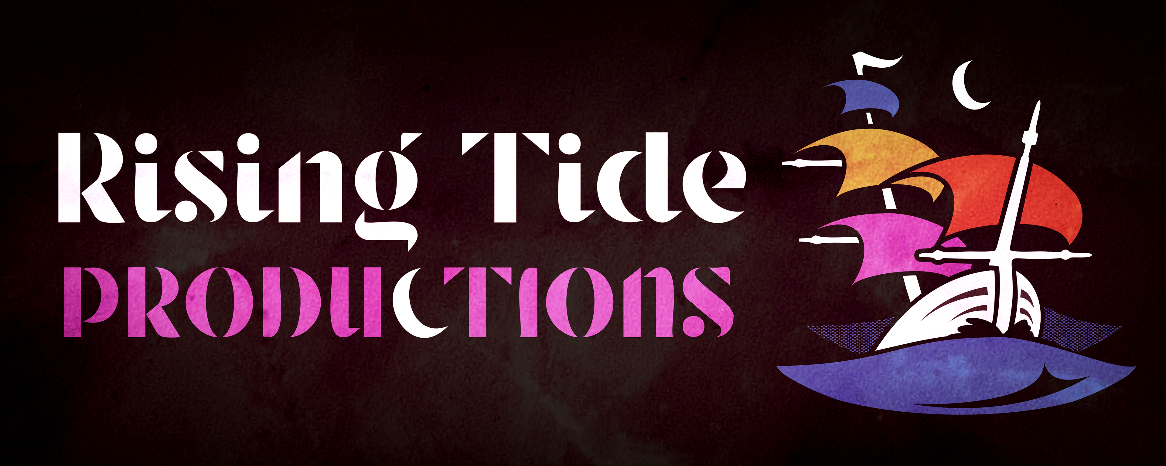
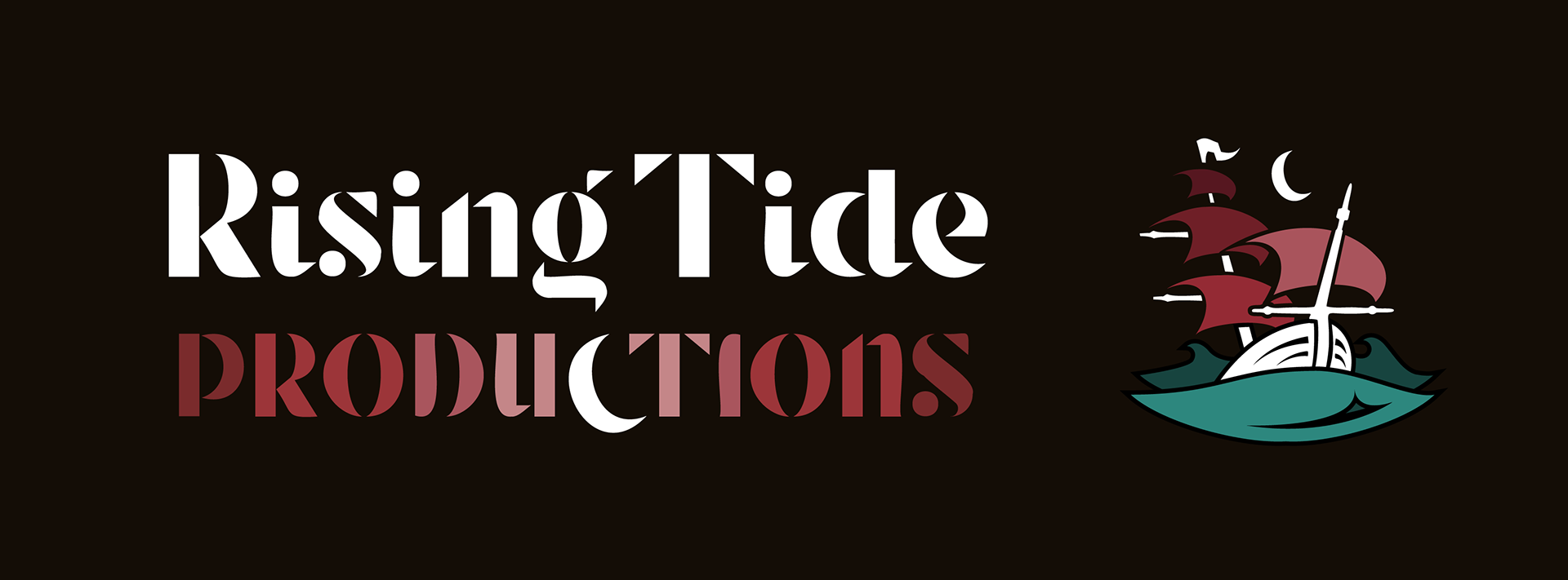
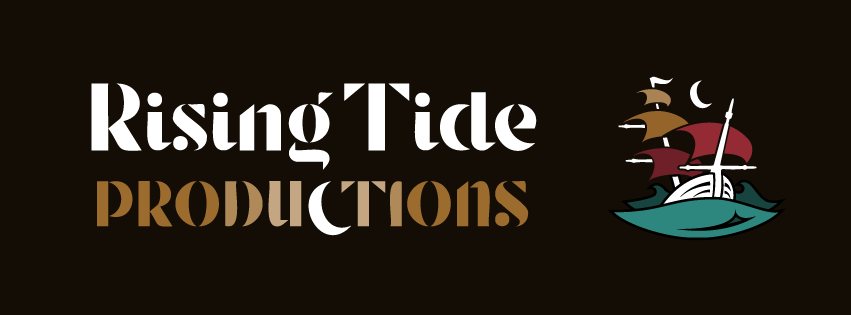
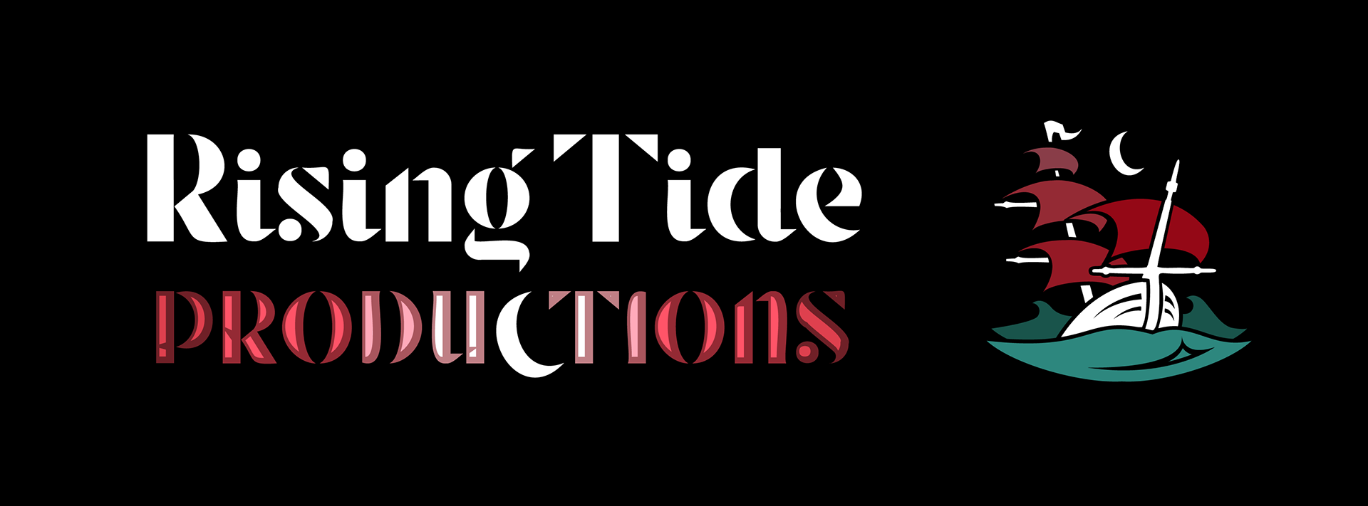
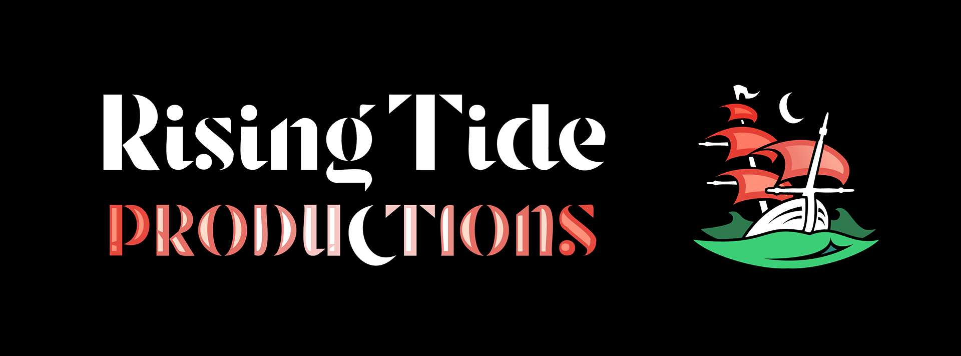
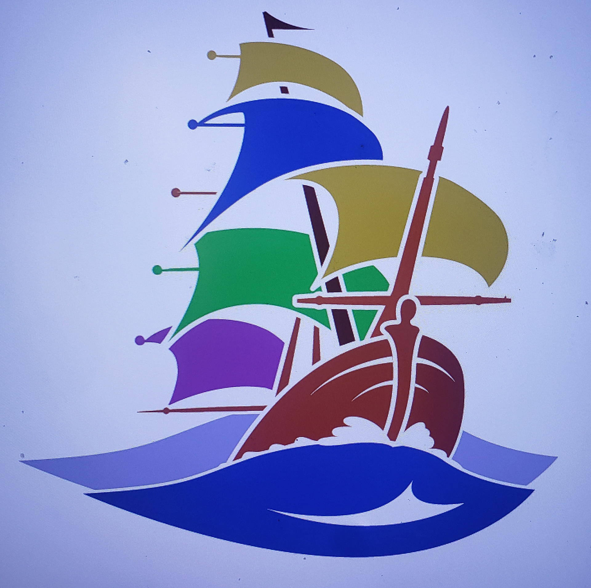
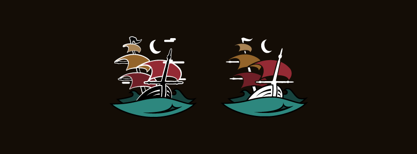
The final product resulted in a wealth of implicit visual appeal and serendipitously illustrated the notion of Tide with the inclusion of the moon. The wine and turquoise tones also illustrated the sophistication that the team was proud to achieve. The final nameplate and its other elements are still in process below.